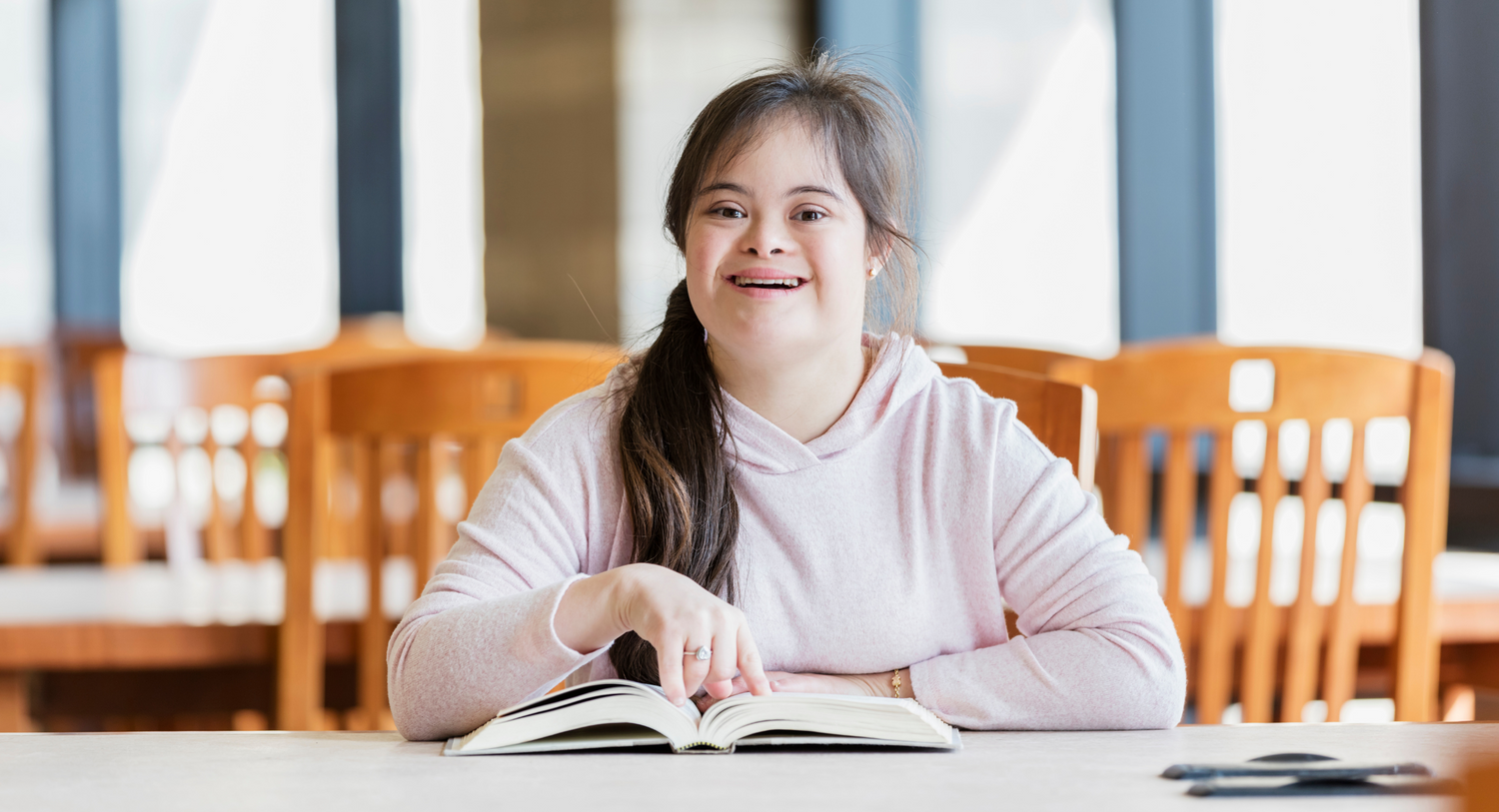
Photos and pictures can help to illustrate content, making it clearer and easier to understand. Good image choices and accessible practice can make content more accessible to people with disabilities.
However bad image use can also be a barrier, and at worst, lead to poor representation.
Accessible images for people with cognitive disabilities
Images are often used to create accessible content for people with intellectual or learning disabilities. For instance, Easy Read (or Easy English) makes plentiful use of images and graphics to emphasise the meaning of the text.
If you’re creating Easy Read content, here are a few principles to keep in mind:
- Keep your images left aligned – with text to the right.
- Use some white space between different images and sections of text. This helps to keep different ideas separate.
- Keep the background clear of clutter in each image. If possible, give each picture a white or plain background.
- Make sure that your images and graphics are clear and easy to interpret. They should make the meaning of the text clear, and should not be confusing or obscure.
- You can use photographic images, graphics or line drawings – as long as they are clear and meaningful. Everyone has different preferences for which type of image they prefer and why. Try asking a few people from your intended audience what they prefer.
Accessible images for people with sensory disabilities
Your content should always consider how people with low vision, blindness or deaf people will access your materials. This is essential, whether you create a document, graphic, webpage, newsletter – or any other kind of print or digital content. Your audience may be using screen-readers, magnifiers or other technologies when they access your content.
Here are some tips to make sure your images are accessible;
- Make sure there is enough contrast in the colours you use. Your text and imagery should stand out clearly, with high contrast between foreground and background colours. Many software programs have in-built tools to check the accessibility of your work. There are also online contrast checkers to help you decide if your colours have sufficient contrast.
- Don’t embed essential information within an image. Make sure that text is a stand-alone element as far as possible, on your document or webpage. It can be hard for some people to read text within an image. Screen-readers may not be able to ‘read’ the text either.
- Use the alternative or ‘alt text’ function. This provides a description of the image for people who cannot see it. You can add alt text to images in a document, PDF or a graphic design. You can also add alt text to images on webpages, emails and other digital communications. If an image is purely decorative and has no meaning - you can skip the alt text.
Respectful and equitable representation
One principle should be foremost, regardless of the kinds of content and illustration you are using: always strive for respectful and inclusive representation.
Choose respectful images of people with disabilities – to make sure your representation meets everyone’s expectations and does not present any bias or stereotyping.
You may want to review your image choices to see whether you have included a range of personal and cultural characteristics, and a good representation of diversity. For instance, check whether you have a fair balance of male and female characters, across a range of different ages. If you are representing people with disabilities, make sure you include a range of different disabilities in your materials. You should also represent people from a range of cultural and ethnic backgrounds.
This helps to make sure that your content includes everyone, and avoids exclusion or underrepresentation of important people in your audience.


